Saturday, December 10, 2016

Week 15 // Project #5

1. Use the vocabulary you have learned in class to describe this artwork or performance in detail.
Guernica is an oil painting created by Pablo Picasso which uses little to no color and is a very abstract piece of work. The human and animal-like figures in this painting are lacking in proportion. The space in Guernica is extremely unorganized. There is text located within the drawings of the figures. The unique use of line and shape makes this painting abstract.
2. What processes were used to create this work? What social influences might the artist be responding to and why?
Picasso kept in mind Darwinian while creating Guernica, specifically while creating the figures. Picasso created this painting to connect with and respond to the shift towards modern art and cubism during the time period in when this painting was created-- and he introduced the use illusion and pop art. Picasso also used disproportion in this painting. Pop art, modern art, and illusion in art was rising during this time. The social influence on this painting is the war and bombings that were happening in Spain.
3. What is the relationship of this work to the time and society in which it was created? Describe the symbols used to express this relationship.
Guernica was created in 1937 and was known as an anti-war painting. Picasso specifically made Guernica as a representation of bombings in Spain from Germany. It was then put in an exhibit and rose money to go toward the Spanish Civil War. The symbolism in this painting shows the chaos that occurred in the war as well as the terror and sadness that occurred.
4. Identify elements in the work that evoke a persuasive or emotional response. Be specific about what those responses are and why.
What evokes an emotional response is the dim colors in the painting as well as the people with their mouths open and their hands up. It shows the terror that occurred during the war and truly lets the viewer know the sadness that happened. It shows that the people were going through a terrible time.
5. Evaluate what you perceive to be the strengths and weaknesses of the work.  Apply discipline specific vocabulary and concepts when describing your point of view.
A strength of this work is the abstract figures. I believe that Picasso did very well on these figures because it shows the emotion and mood of the war that the people went through. A weakness in this work is the text print in the figures, because I am not sure how that relates to the war.

Resources used:
https://www.merriam-webster.com/dictionary/Darwinian
http://legomenon.com/guernica-meaning-analysis-of-painting-by-pablo-picasso.html

Week 15 // Art Gallery Visit #3: Self-Portraits Art Making/Material Exploration Blog

-- INSPIRATION PIECES --
Title: Self-portrait
Creator: Dmitry D. Zhilinsky
Year: 1993
Dimensions: 52.3 x 72.3 cm
Medium: Oil on fiberboard

Title: Self portrait
Creator: Stella Brown
Year: circa. 1934
Dimensions: w39.1 x h49.5 cm
Medium: Oil on canvas

 
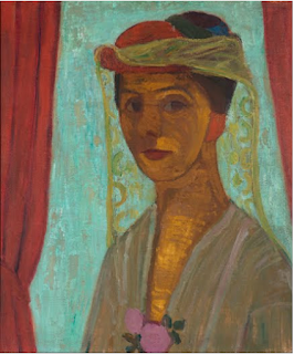
Title: Self-portrait with hat and veil
Creator: Paula Modersohn-Becker
Year: 1906/1907
Dimensions: w798 x h896 cm (framed)
Medium: Oil on canvas

-- MY PIECE --

-- QUESTIONS --

1. Why did you select the inspiration pieces?
I selected the inspiration pieces because I wanted my portrait to look realistic but not too realistic. I also took inspiration of the strokes in the inspiration pieces. I like how they're well done but not super realistic.

2. Why did you select the media to create your self-portrait?
I selected acrylic paint on a cork-like board to do my portrait. I chose acrylic paint because it is easy to blend and I feel comfortable painting with them. It is my favorite media to work with. I also added cloth to the background to add texture.

3. What challenges did you face in creating your self-portrait and how did you overcome them?
At first, I really could not get my face right. I had trouble trying to make it look like me because I did not copy the photograph of myself completely instead I took inspiration from my photograph. I had trouble perfecting my nose. I felt awkward creating a self portrait.

4. How does this piece represent you?
This piece represents me because it is definitely my style of painting. I like how I used the close in the background because it reminds me of my style.

5. What elements and principles of art did you apply in this work?
Shape/form
Color
Value
Texture
Balance

6. Did you enjoy working on this project?
Yes! It was very hands-on and fun. I really enjoyed it.

7. What do you think of your final artwork?
I am not a huge fan of it, because I don't think I'm too great at art but I did try my best so I think I did pretty good for that. 


Sunday, December 4, 2016

Project #4 // Reflection Journal

In this project, I had a specific process while creating my slide show.

At first, I had to think of a theme. I changed my theme probably about six times throughout this project. I wanted a theme that was interesting so I could go in deep detail with it as well as a theme that would not be common in our online group. For my theme, I chose Self-Portraits created by famous artists. Once I created a theme, I googled famous artists and Google had a wide variety of information on famous artists from the 1500's to the 1900's.

I used the Google Art pages to find my photos for my curator project. I was kind of frustrated while using the Google art pages because they did not have a wide variety for the majority of the themes I originally planned to do. Luckily, I found at least 10 well-known and famous artists who created self portraits of themselves. I search 10 images, screen shotted, took down the page, and wrote down the information I needed for each slide. Then I started to create my slideshow.

I wanted my theme to seem as though it was truly in an art gallery. I went with a sophisticated theme for the color scheme for the slide show. For each slide, I put the screenshot of the self portrait as well as the information needed and the direct link to the page where I found the art pieces.

Each slide has it's own information slide along with it, where I share a small fact about each artist as well as what is within the self-portrait that helps fit my theme.

Overall, the project was fun to do. I wish that the Google art pages had more variety of photos -- the ArtStor page was not working for me so I could not use it. It was fun creating the slideshow and learning about artists who created Self-Portraits. My favorite person to do research on was Andy Warhol because I love all of his work. The project was a lot of fun to do though.

Wednesday, November 30, 2016

Blog Topic // Reflections of AED 200

1. What were you expectations for this course and where they met?
In this course, I expected to learn a lot of about using the internet for art. I also expected to learn how to become more organized with my time and how to do art on my own without a live instructor. I said that it should be fun and I was very excited. All of my expectations were met. I'm very happy with that.
2. Now that you've been through this course, What is art? How would you define it now compared to your initial posting?
Now that I have been through this course, I can say now that art is self expression. 
3. Who was your favorite artist in your original posting and who is your favorite visual artist now? If there is a difference, why do you think so? If you have the same favorite artist, why do you think so?
I said that my favorite artist was my friend Olivia in my original posting. Now, that still holds true because she is a dear friend, but I really enjoyed learning about other artists. Olivia is still my favorite artist, probably because I know her personally and can speak with her about her artwork.
4. Now that you've completed this course, how do you feel about taking an online course? Is your answer the same as it was in your first posting? How is it the same or different?
In my original post, I said that I was nervous about taking an online course and hoped that I could better my origination skills. I love taking online courses now. It is great for my schedule and I've learned that my time management skills as well as my organization skills are great. I will probably take more online classes now because this one was so great and I had a great experience.

Extra Credit Questions

1. Which assignment did you ENJOY working on the best? Why?
I really enjoyed the assignments where we had to go to the art museum. I liked these assignments because since it is an online course, it gives me a reason to go out and learn. I liked that when I went to the museum, no one really knew why I was there, and I got to explore. Taking photos and analyzing pieces of art that are right in my city were really neat experiences for me and I liked that each time I went, there were different exhibits to go through. It made it easier to be motivated to do the assignments for the art gallery visits.
2. Which assignment did you ENJOY working on the least? Why?
For this question, I'd have to say the assignment I least enjoyed working on were the hands-on, creative assignments where we had to use materials to create and draw ourselves. This is probably just a personal thing because I am better at digital art. If I had a question, I couldn't really get a straight away answer and that's another reason why I disliked those assignments the most.
 
3. How did you like using BLACKBOARD?
I liked using blackboard a lot. The calendar for the assignments were clear and easy to navigate. This is one out of my two online classes this semester and I'd have to say the set up of this course was more clear than the other one.

4. What is your opinion of the Discussion Groups in this course?
The discussion groups in this course were very helpful. I did not really post in it often, but I did go there for answers when I needed to because others usually posted the question I needed to know. I think this option was very helpful and a great additive to the course. Extremely helpful.

5. Did you participate in any of the extra credit projects in previous modules? If so, what was your opinion of them? (mandala, elgin marbles, culture, art critics)
I did, I believe, one extra credit project in the previous modules. I did only one because of my busy schedule but the one I did do, it was very enjoyable especially for an extra credit project. Usually, extra credit projects are no fun and extensive for no reason-- but yours were very knowledgeable and neat. 

6. If you had the opportunity to change this course:
What would you keep?
The layout of Blackboard, the Calendar, the Discussion forums. All of the projects. I like how the due dates were on the same day every week, being Saturdays and Sundays.

What would you remove?
I do not think I would remove anything, to be quite honest with you.

What would you add?
I would add updated videos for the video reviews. They were knowledgeable and cool, but a little outdated and long.

7. Would you recommend this course to your peers?
Absolutely!!

8. Please list any other comments you would like to share.
I enjoyed this course. Thank you for making it fun and interesting!

Tuesday, November 29, 2016

Module 13 // Video Reviews

1. For each video list/discuss the key concepts you learned.
An Acquiring Mind: Philippe de Montebello and The Metropolitan: 

  • The Book of Revelation
  • Small symbolic statues
  • The Gilman Paper Company
  • Artwork Storage and longevity
  • Theories on creation
  • Draping fabrics and tapestry
  • Preservation of artwork
  • Water immersion


The Lowdown on Lowbrow: West Coast Pop Art

  • Direct definition of Lowbrow art, no one can really explain it
  • There is Highbrow, Middlebrow, and Lowbrow
  • Originally the artwork of lowbrows had naked women and cartoons in it
  • "Hot-rod culture"
  • The artwork has expanded since then
  • Lowbrow, surrealism
  • Lowbrow is equal to "newbrow"
  • World War 2 & Tattooing was popular for lowbrow art
  • Psychedelic Rock posters
  • Jackson Pollack
  • Galleries
  • Music and Art


2. Do the videos relate to the creation of your Art Exhibition project? If yes, explain how. If no, explain why not. 
The videos related to my creation in my Art Exhibition project in making me think about a couple different kinds of art. I got to think about certain styles and ways to make art and the background behind it, especially in the West Coast Pop art because it seems so laid back and nice. I will keep in mind the videos when I create my exhibition.

3. What is your opinion of the films? Do they add depth to understanding of the art concepts you practiced while creating your curation project?
The films were interesting. Although they're a bit extensive and long, the information in them is important and neat. It helps me get a deeper understanding.

Friday, November 11, 2016

Module 12 // Video Review

1. Explain why you selected each of the TWO videos you choose from the selection listed above.
I chose Andy Warhol: Images of an image because I am quite familiar with his work but I wanted to learn more so I thought this video would give me that opportunity. I chose Uncertainty: Modernity and Art because modern art is interesting so I thought I'd enjoy the video.

2. For each video list/discuss the key concepts you learned.
Andy Warhol: Images of an Image:
  • Ten Lizes is was made by Andy Warhol in 1963
  • Andy Warhol wanted to be a tap dancer before he found his love for art and worked on magazine art as well as advertisement art
  • He drew advertisements for shoes, makeup, cosmetics, plastic surgery, Coca-Cola, and Campbell's Soup
  • When Marilyn Monroe died, he selected a photo of her and used a silk screen machine to create an image of her, in a variety of colors
  • Used a silk screen machine a lot for his art
  • Uses vivid colors that clash (for effect)
  • Andy's style was heavily focused pop art
  • Marilyn's face made him famous
  • Elizabeth Taylor
  • Infatuated in Elizabeth Taylor's relationships
  • Shows the way how to use silk screen imaging
  • Too much paint or ink or misuse of a squidgy can ruin an image
  • Warhol was in a movie with Elizabeth Taylor
  • Started using Polaroid photos
  • Clients were willing to pay a small fortune for each portrait Warhol took and made of them
  • Warhol was narcissistic and made a lot of self portraits
  • He was an art journalists
  • His main theme is death

Uncertainty: Modernity and Art:
  • Modern art was created and takes place in 19th/20th Century
  • Modern art includes bright colors
  • Advertisements
  • Pop art
  • Abstract art
  • Art of restless questioning
  • Modern art never stops changing
  • Art of views that collide together
  • Abstract art expresses how the artist feels
  • Pop art started in the 50's and 60's
  • Pop and abstract art is open to any individual how they perceive it
  • Modern art used to be a minority interest

2. How do the videos relate to the readings in the text?
Andy Warhol is known for pop art and the text refers back to and talks a lot about pop art. There is a Marilyn Monroe picture by Andy Warhol in the text as well. The Uncertainty video relates to the text because it references expressionism, abstraction art, and pop art.
3. What is your opinion of the films? How do they add depth to understanding of the readings and art concepts?
I enjoyed watching this video a lot because it had a lot of information about pop art. I enjoy pop art a lot so I found it very interesting. This adds to the depth of my understanding because it is a visual I can't view and deeply understand.

Module 11 // Art Museum Visit #2

The Exhibition Questions about the exhibit:
1. What is the title of the exhibit?
Rosalyn Drexler: Who Does She Think She Is?

2. What is the theme of the exhibition?
Many themes pertaining popular culture and the representation of gender roles in mass media.


The Gallery Questions about the physical space: 
1. What type of lighting is used? 
Bright, white, up above lighting

2. What colors are used on the walls? 
White colored walls. The welcoming sign of the exhibit is a bright purple fuchsia color.

3. What materials are used in the interior architecture of the space? 
Frames only. It was very simple.

4. How is the movement of the viewer through the gallery space? 
The viewer moves very freely. The space is very open. The viewer can look at several pieces of work while viewing this exhibit.


The Artwork Questions about the artwork: 
1. How are the artworks organized? 
They are organized around the gallery on the walls.

2. How are the artworks similar? 
They all have the same style as well as bright colors, people, and medium used.

3. How are the artworks different?
Each piece of artwork is different by each piece of art has a different story behind it.

4. How are the artworks framed? 
The artworks are framed in either white or black frames.

5. How are the artworks identified and labeled? 
The artwork is identified and labeled by a small label on the wall beside each piece of art.

6. What is the proximity of the artwork to each other?
Each piece of art shares the same theme as well as colors, medium, and the overall look.


Art Criticism Exercise 


I Won't Hurt You, Rosalyn Drexler 1964
Acrylic and paper collage on canvas

This piece of art shows a man behind a woman covering her mouth. It is very pop art, with the colors. This piece of art uses line, shape, color, as well as perspective. This piece of art also uses balance. I think that this piece is to explain that the man is saying "I won't hurt you" although he has his hand over her mouth. "I won't hurt you" is a common phrase said when a person might hurt someone.
Self-Defense, Rosalyn Drexler 1963
Acrylic and paper collage on canvas

This piece shows a woman with her shirt half on/unbuttoned, on top of a man with a weapon. This is supposed to be viewed as a woman protecting herself, which is why the title is Self-Defense. The color is blue to make the viewer feel stressed. This piece of art uses color, form, and space as well as proportion and emphasis. The emphasis is on the woman and man.                                                                                                  

Rape, Rosalyn Drexler 1962
Acrylic and paper collage on canvas

This piece of art shows a dark figure attempting to rape a woman whose body language seems very uncomfortable. This piece of art uses color, form, and space as well as proportion and emphasis. The color yellow is to make the viewer feel worried when viewing this. The emphasis is on the man and the woman.

What did you think of visiting the Gallery and purposefully looking at the exhibition from a different perspective - the physical space, the architecture, theme, etc.?
I love the Al-bright Knox because I have been going there for while now. Their exhibits are always so nice and put together, as well as aesthetically pleasing and interesting. I never looked at an exhibit there so specifically so it was fun diving into one specific exhibit and focusing on it. It makes you appreciate the artists a lot more.

Module 11 // Video Review

1. Explain why you selected each of the TWO videos you choose from the selection listed above.

I picked Matisse and Picasso because I am quite familiar with them and I wanted to see if there was any information in the video I was not sure of. I picked Expressionism because I genuinely enjoy it.


2. For each video list/discuss the key concepts you learned. 

Matisse and Picasso:

  • Picasso was born in Malaga, Spain  in 1881
  • Picasso father was a drawer and painting teacher, which sparked Picasso's art interest
  • Picasso was born with a natural gift of painting
  • Matisse was silent and stubborn
  • Matisse not immediately talented in art and did not discover his talent for 20 years
  • His talent in art was known as a family scandal
  • The two are opposites by Matisse wanting to rationalize everything in art, where as Picasso described himself as a hard worker
  • When Picasso and Matisse meet, they exchange paintings to seal their mutual respect for each other
  • Both Picasso and Matisse are "brothers" in anguish and say that if you want to work hard, you must always be on edge

Expressionism:
  • All sorts of different paintings that use expressionism
  • The use of colors to express what is happening in the pieces of art
  • "Scream" by Munch uses expressionism and he says that the colors while he was walking home during sunset one day screamed at him which inspired him to create the piece of art
  • Munch uses expressionism in a lot of his art
  • Colors are use a lot in expressionism to show the mood of the art
  • Expressionism art uses symbols
  • Expressionism usually shows sadness, anxiety, trauma, hope, or tragic events

3. How do the videos relate to the readings in the text? 
The videos relate to the readings in the text in many ways. The book refers to and talks about expressionism a lot. There are some paintings that the text refers back to which was in the book.


4. What is your opinion of the films? How do they add depth to understanding of the readings and art concepts? 
The films were very educational for me. Although they are an hour long, and the people talk extremely slow, I use the speed up option to make them talk faster so the films are more bearable to get through. I do enjoy the films and they give me insight on what I should be learning about. 

Sunday, November 6, 2016

Module 10 // Art Making/Material Exploration Blog: Mask Making

1. Three (3) Inspiration photos // Why I chose them // Descriptions & Art Criticism 


I chose these pieces as my inspiration pieces because I love gold and the sun face. I find this to be very powerful looking and it reminds me on the Egyptians as well as Greek Mythology. I really enjoy this style and I find it very interesting.
Mask #1
  • This is a gold/bronze mask and I really like it because of it's color. This mask balances because it is symmetric. The middle piece really stands out to me. It has a pattern to it on each side that I like, too.
Mask #2
  • This mask is subtle abstract. I find the sun rays on the mask to be very different and I like it. The color of the mask is gold as well, so it really symbolizes the sun. This mask balances well with being asymmetric. There seems to be some form of texture on the mask.
Mask #3
  • I take inspiration from this moon face for my mask because I have always liked this face. It is balanced with being asymmetrical which is different and neat. The texture on the face makes it look semi-realistic.

2. Upload images of your sketches and finished piece // Elements & Principles used in finished mask


Elements & Principles Used

  • Balance -- Symmetric
  • Color -- Red, yellow, & orange
  • Pattern -- Lines shapes on the side of mask
  • Form -- 3-Dimensional


3. Share your opinion of your finished mask and what you thought about creating the mask.
I had fun creating the mask, although I feel it did not turn out the way I wanted it too. I like inspiring myself with the the initial 3 photos, but using the tools I had, I feel as though I could have made a real mask better. I was challenged during this assignment but I am okay with that because it was fun, interesting, and educational.

Friday, November 4, 2016

Module 10 // Video Review

1. Explain why you selected the 2 videos you chose from the selection listed above.
I chose the video on Buddhism because the Buddhist religion really interests me. I love the symbolism in Buddhism like the Lotus flower because it is very peaceful and nice. I chose the video African Art: Legacy of Oppression as well because African art is very small and neat and abstract. I find it interesting because it represents a time I am not to knowledgeable on. 
2. For each video list/discuss the key concepts you learned.
Buddhism:
  • Bodhi tree (pipal tree)
  • Enlightenment
  • Buddhists art & architecture includes stupas, stone, stone umbrellas, buildings.
  • 14th century is when Sanchi was discovered.
  • 4 gateways of Buddha's life
  • South gateway has a wheel of law that is worshiped by devotees (ex. monks & pilgrims)
  • Each gateway is built with square posts, crowned with lion, elephant, and pot-belly dwarf sculptures.
  • Pilgrims can be infatuated with the art, but call Him for mindfulness.
  • The balustrade (walkway) used wood techniques in stone.
  • Stupas were carved with serious of medallions.
  • Stupa umbrellas represents the 3 level of Nirvana, Buddhist heaven
  • Largest Buddhist shrine is called the Borobudur in Java, Indonesia
  •  Borobudur is a stepped pyramid in the shape of a Lotus and took 100 years to make.
  • Lasted 30 years of pilgrimage until volcano exploded
  • Chuang Yen Monostary is in Carmel, upstate New York
  • Kuan Yin hall was built in the architect style in 1985
  • Centerpiece is a large Buddhist sculpture at 6 ft. tall and is made of ceramic
  • Simplicity architecture by than Tang Dynasty
  • Glulam structure, structure that allows buildings to have no ceiling pillars & no structure, made of layers of timber glued together
  • Surrounding is 10,000 small Buddhist sculptures.
African Art: Legacy of Oppression:
  • Yombe masks worn by priests with the spirits of the dead whose colors were white.
  • West African art is more abstract
  • Not a lot of naturalistic art is found in African.
  • The signs of the art can be read by the people of their society.
  • Magical dead pieces of art which contain containers for magical potions
  • Masks represent certain things-- the half black & half white mask represents the black side being ill and the white side being pure and healthy.
  • A mask scared male kids to adulthood, making them respect their elders.
  • Boa culture masks were made to intimidate people in battle.
  • The Boa stopped creating the masks when they realized the magic didn't work, since their people were being shock and killed by Western people and their guns.
  • Belgium massacre in 1880 -- the slaves created a lot of art.
  • Ivory (elephant tusks) were used a lot to make sculptures and pieces of art.

3. How do the videos relate to the readings in the text?
The videos relate with the readings in the text because both the text and videos talk about the relation of art and religion. People use their religion in art a lot now and in history. The text goes into detail on the Buddhist religion and the art that comes along with it. The videos expand my knowledge on both the religion concept and the art concept.

4. What is your opinion of the films? How do they add depth to understanding of the readings and art concepts?
I believe these videos were very informative and were beneficial to my understanding of art. It added depth to my understanding by showing images of certain art and going into depth of  religion and art as well as culture and art.

Saturday, October 29, 2016

Module 9 // Art Making/Material Exploration Drawings - Exploring Line

1. What was it like using your hand as subject matter for a drawing?
Drawing hands are quite fun, so I thought it was interesting and fun. I think hands have a lot of detail and everyone’s are different so it is neat to draw. It is kind of ironic too, drawing hands, because hands create art and we are drawing what creates art.

2. What media did you select - pencil or charcoal? Why?
I chose to use a pencil on this project because I had a pencil in easy access rather than the charcoal. Also, charcoal is very messy but easy to work with and I wanted to challenge myself with a more precise pencil.

3. How did it feel to create a drawing with your non-dominant hand?
It felt strange, but I have always been kind of ambidextrous since I was a kid and was able to write with both hands. It felt different and challenging, but easier than most people’s experiences though.

4. Compare and contrast your final drawings. Do you think they are successful studies?
I think I did an OK job. They are definitely not the most detailed, amazing drawings but they do look like hands and I tried my best that I could and put all the effort I could into them. I think they are quite successful studies.

5. Would you consider using your non-dominant hand to create artwork in the future?

Depends on the media/medium & supplies I use-- I definitely would for abstract paintings and such but probably not for very detailed drawings or pieces.. I think it would be quite challenging to try to do a piece of art extremely detailed and precise with my non-dominant hand, but for an abstract piece, I feel it would be good.


Module 9 // Video Review

1. Explain why you selected each of the TWO videos you choose from the selection listed above.
I chose these two videos because I have never heard any information in depth about the two artists. I have heard of them, but I did not learn anything quite deep about them. I wanted to expand my knowledge on different artists and I picked these two videos because I wanted to learn more about Durer & Velazquez.

2. For each video list/discuss the key concepts you learned.
Velazquez:

  • Learned about Velazquez and his life
  • Velazquez studied Greek Mythology for his art
  • He painted slowly, but that’s why his work are masterpieces 
  • He was very educated
  • He died a week after his wife
  • Goes into depths about specific paintings he made
  • He finds individuality beautiful and that nothing can be ugly
  • He has his own sense of beauty
  • In his paintings, he picks specific parts of his paintings that show emphasis

Albrecht Durer: Image of a Master:

  • German painter
  • He made a portrait of his father at age 19
  • Enjoyed painting hands
  • He has 17 siblings and his mother buried 15 of them
  • Did a lot of travels
  • Created prints
  • Married a 15 year old named Agnes Frey
  • He went to Italy for 4-5 months
  • Talks about specific artworks of his
  • Uses triangles, circles, and squares when creating his portraits
  • Shows religion in his art

2. How do the videos relate to the readings in the text?
The videos relate to the readings in the text by explaining and having a section on the Renaissance Era and showing the art that was created then. The text explains the art that was created during the Renaissance Era as well as the artists that lived then.

3. What is your opinion of the films? How do they add depth to understanding of the readings and art concepts?
I believe that the films are very beneficial to my knowledge of art. They are full of information and they are interesting. I think they are good at teaching me a more in depth understanding to the readings and the art concepts.

Friday, October 21, 2016

Module 8 // Video Review

1. Explain why you selected the video you choose from the selection listed above.
I chose the video of Greek Awakening: Art from the 5th Century BC because I am currently in a Classical and Biblical literature class, in which we are reading Greek mythology, so this video in specific stood out to me. Greek art interests me. 

2. For each video list/discuss the key concepts you learned.
More Human Than Human:
  • Human figures that are "perfect" are rarely ever created, for they are usually not symmetrical.
  • Carvings are as old as 1000 years or more.
  • The culture of the artists can be shown through their art.
  • The background culture of artists is a widely studied through their art and is a huge reason why we study art.
  • Drawings and art can give people in modern time clues and an insight on what was going on in the culture when the drawings and art were created.

The Greek Awakening:
  • Art started to represent Greek culture once the Greeks started focusing on themselves.
  • Parthenon is a temple in Athens, Greece which is still standing and is being preserved.
  • Preservation of this temple is taken very seriously.
  • Parthenon, the temple in Athens, Greece, is dedicated to the Greek goddess figure, Athena.
  • Temples that stood before Parthenon did not hold up well and deteriorated mostly.
  • Greek culture really adopted sculptures, so that's why Greek art is associated with sculptures mostly.

3. How do the videos relate to the readings in the text?
The videos relate with the readings in the text because in the text, it goes into the philosophy and "why" artists create art. The focus of both the videos and texts is that in the art, the artist's culture is shown through the style of art and how it could be dated back to specific time periods. 

4. What is your opinion of the films? How do they add depth to understanding of the readings and art concepts?
I believe these videos were very informative and were beneficial to my understanding of art. It added depth to my understanding by showing images of certain art and going into depth of the culture of humans and Greeks.

Saturday, October 15, 2016

Module 7 // Video Review

1. For each video list/discuss the key concepts you learned.
Prairie Style:
  • Frank Lloyd Wright, the architect of the 1890's & early 1900's
  • Liked long, natural surroundings in home design
  • Harmony and nature
  • Open spaces, so everything was connected 
  • Lots of windows
  • Good lighting and plants outside to add privacy
  • Francis Sullivan, a Canadian architect, who was inspired by Wright
  • Environmental harmony and organic
  • Created the 1965 house design called "Frazier" which was inspired by Wright with lots of windows, open spaces and rooms, harmony and nature.
  • Wright wanted to leave respect for open spaces and nature

Architecture: The Science of Design:
  • Skyscraper designs
  • The problems when designing tall buildings and skyscrapers
  • Science behind wind and tall buildings, causes problems
  • Wind makes buildings sway which can cause problems with elevators, structure, etc.
  • Add trees so the problem can be helped
  • Snow and air quality because of the tall buildings
  • "Smart apartments" and the intelligent homes-- The science and technology behind making these overly intelligent homes that talk and do things for the person who lives in it, like open blinds in the morning, turn on the shower, make coffee, turn on lights, etc. 
  • Concrete and cement-- the making of it and different kinds like Portland concrete, confined concrete, etc.
  • The resistance of each and different kind of concrete and how metal bars are placed in concrete in case it cracks.

2. How do the videos relate to the readings in the text?
The videos relate to the text readings by them being primarily focused on architecture. The Prairie video explains Frank Lloyd Wright's work and in the text reading, there is a section about him. The videos go into depth about a lot of architecture and what it is all about, showing the viewer whereas the text explains facts with some photos.
3. What is your opinion of the films? How do they add depth to understanding of Architecture?
The films were nice. They were beneficial to me because I like how many visuals they had of each example. They were extremely educational and very to-the-point. They add depth to my understanding of architecture because I was taught a few new things I did not know before.
4. Why did you choose the films that you watched?
I chose these two videos because modern architecture sparks an interest in me, personally. I really enjoyed the layout of each of these videos and I found them the most interesting. HomeDesigns is interesting and shows the inside and out of houses which I really enjoy.